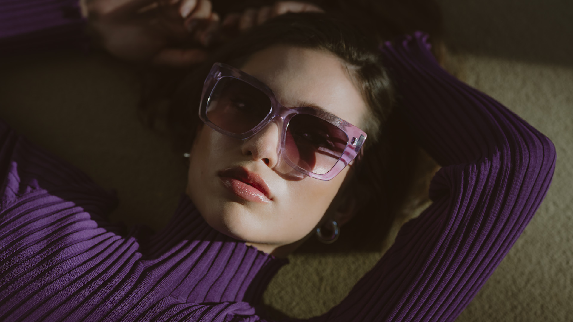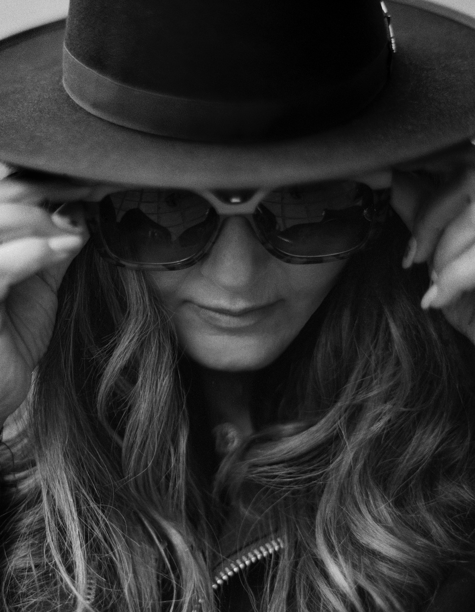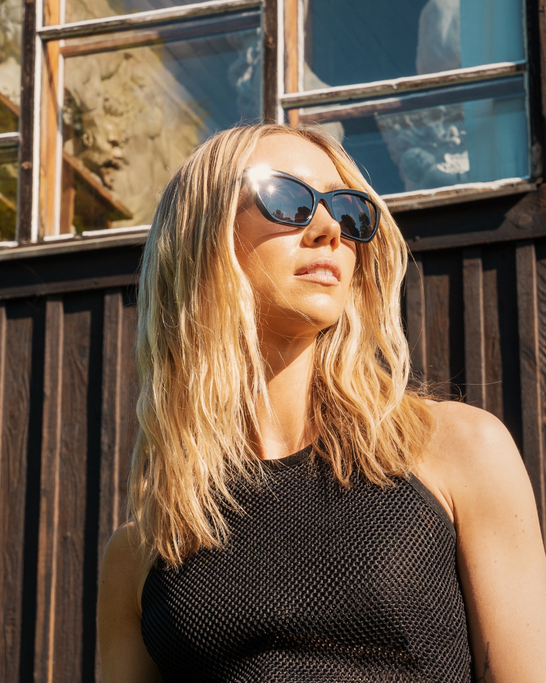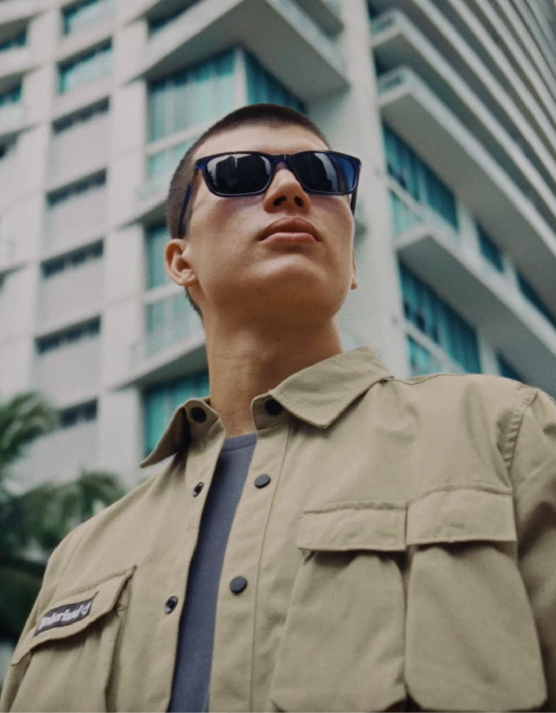
Photo: Courtesy of Barton Perreira
Behind the scenes
Back to storiesAbout
Summer in your shades
Following the rhythm of the colour wheel that, like the Plough in the sky, recalls the idea of movement, we observed the transition from the cold season to the warm one together with Silvia De Col, Colour & Material Coordinator at our Longarone headquarters.
The colour wheel that dominates the Style Department in Longarone brings to mind the ancient native American Medicine wheel.
If the map of the Universe of these peoples is still today structured with elements that contribute to the essential changes in life and in nature, where every colour has its own meaning and speaks of the Great Spirit that regulates the world, at the Marcolin colour wheel there is a great team of creatives and colour and material specialists. Silvia De Col is in charge of this curious and inspirational chapter in the story of how the eyewear colour palette changes from winter to summer. Since the very beginning, it appears clear that colours speak their own language and that it takes skill to channel them towards effective interplays of light and shadow.
Brighten up the tones.
«For this colour and material analysis we used as reference some combinations featured by one of our brands for fall-winter, whose colours and material finishes evoke the winter season. Our goal was to brighten up these tones without denaturing the brand’s signature palette» says De Col. «We also wanted to maintain a common thread running through the two seasons» she continues. «So, we worked with the colour wheel and turned on the light» she adds passionately. «We managed to brighten up the colours and the typical wintery shading, while maintaining the colour combinations by adding white». But to convey those emotional vibes that turn the warm season into the season of love, the team also focused on a colour trend analysis.
Three macro-themes were created. «The first one expresses itself through natural tones, such as brown and Havana. The second one features pastel and dusty hues, which clearly recall powder tones, like make-up. The third trend instead expresses itself through pop nuances» remarks Silvia.

Unmistakable summer vibes.
«We combined these three worlds together, leveraging on unique interplays of light that brighten up the hues. The colour Havana, for example, is more neutral and toned down in its winter version than in its summer one, which instead is enriched with tones of mint. This shade of green, according to our trend analyses, is perceived as more joyful and better suited for the summer season».
This method was used for all the colours and materials featured in the collections, because playing with transparency or design in general, combined with a colour palette, is not just a question of style. The secret lies in finding combinations that highlight the type of design you wish to enhance.


